
2014 was a fantastic year for the web design industry. A totally new generation of layouts and web apps, advanced W3C specifications hand in hand with modern web browsers and a HTML5 invasion, have brought the web designers and their clients to a new era of digital design.
With 2015 almost knocking at the door, we want to count (retrospectively) all the UI/UX trends that made our eyes tremble with joy and our fingers to anxiously slide on those touch screens for hours.
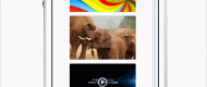
Grid Style Layouts
Pinterest hit the jackpot with this grid design. Tumbler and Twitter have also spotted the trend, embracing the same streamlined fashion. Lately, it seems that even Facebook scatters its updates on the timeline to appear like a grid. This skimmable trend comes, of course, as an user experience necessity. The content has to be grabbed with one look and easy readable. See, read, slide – this the grid style in a nutshell, and Masonry can provide you with the best eyes-catching solution.
Typography
Since it holds 95% of the web design mix, typography was and will be an evergreen web design trend. Good typography maintains brand consistency, it guides the readers/users throughout the content, it conveys a visual summary of the website and moves the brand forward. Contrary to all beliefs, typography is more that selecting the prettiest font. It carries with it branding strategies, selling points and the colours chosen are subliminally impacting the conversion rates. If you want to learn some more about typography, check these awesome resources.
Minimalism and Flat Designs
Flat design goes hand in hand with Typography and Responsive Web Design (RWD), all together being the biggest three hypes of 2014. Flat and minimalist elements comprise the most requested and imitated designs in the entire world. This year, everybody has abandoned the older Apple’s trend of skeuomorphism for immaterial features, embracing the limits of the screen and working within those parameters, rather that disguising them. The flat design is the perfect style for great UX, working on usability considerations, as well. By shedding unnecessary styling, the pages load faster, the code is cleaner and endlessly adaptable to every type of application, whether is accessed from a desktop or mobile screen.
Responsive Web Design
Probably billions of articles have been written about this topic in 2014. That means it’s a big deal. RWD incorporates a series of typographic elements with perfect legibility and attractive rendering adapted to each screen size. Every web designer has to juggle between the web content displayed and the aesthetics of presenting that content. With 2014 being the first year when mobile surpassed the desktop, that means RWD is a trend that we won’t forget too soon.
So, responsive web design solves the problem of making the same code work across multiple screen resolutions, using fluid grids, fluid images, media queries, responsive front-end frameworks (Foundation or Bootstrap), responsive images (Responsive Images Community Group or Zurb Interchange) and many other responsive resources (This is Responsive or Mediaqueri.es). Check “Mobile First” a book written by former Yahoo design architect and co-creator of BagCheck, Luck Wroblewki, if you want to find out data-driven strategies and battle tested techniques for mobile web design.
Parallax Scrolling – Infinite Scrolling
Designed as a tool to engage the visitors with a website, the Parallax scrolling directs the course of the scrolling, makes the site easily navigable, storing all the content in one page and creating a compelling narrative around the brand. However, this trend has some disadvantages to be addressed, like page load times, mobile viewing, horizontal movement and Search Engine Optimization.
Infinite scrolling allows users to browse the content through scrolling rather than clicking on page links. The content is automatically loaded, before users arrive at the next point. This web interaction design is used by Twitter, Pinterest, Facebook and an in-commensurable number of other websites. Perfect for touch, visual oriented, better content exposure and browsing, the Infinite scrolling gives room for creativity. However, it can be quite disorienting, footer problems can occur, there is no way of skipping through the content you don’t want to see and the browser often crashes. In conclusion, these two web design trends have both pro and cons, but designers still have to juggle a bit with this solutions, especially with regards to SEO integration.
Read also: 10 Hottest Web Design Trends of 2014 (part 2)

No Comments