Lately, I have encountered many site and blog owners, who wish to turn their existing site into a mobile friendly website. They probably have read the statistics: approximately 20% of users visiting a site are using mobile devices; for some businesses the percentage is much higher, exceeding 50% of the overall visits. Additionally, people today do not use their mobile devices only while there are away from their home or office. Researches show that 68% of Smartphone usage is conducted from home and the numbers increase when referred to tablets.
These numbers should make everybody realize that the mobile usage is not a fashionable trend that will soon evaporate, but a modern way of life; a phenomenon, which will continue to grow and expand in the future. Ignoring the mobile sector is a huge mistake that might soon be translated to heavy loss of traffic and business activity.
Why should you make your site responsive?
With mobile usage becoming a norm, it is obvious why you should convert your site to mobile. If your site is too slow, the text is difficult to read, or navigation is awkward, the user-experience is damaged severely. Mobile users, who are not the most patient crowd, move on to a different site.
In order to mobilize your website, you first must decide if you want to create a second version of your site that will serve the mobile audience or you rather make your site responsive.
A responsive site has a flexible layout designed to adapt itself to any screen size. The smart software recognizes the size of the screen and renders the content, rich media, fonts and elements according to the device in use.
A ‘mobile version’ refers to a separate site, where you can display different content and layout, tailored especially for mobile use. There are plenty of easy, fast and free services like Mobify, Pressly, Conduit or Mofuse that will transform your content to mobile. These solutions guarantee a perfect display on portable devices; however, there are a few disadvantages you should consider:
- A responsive design omits the need for a separate mobile site and releases you from the extra time and expenses involved such as content management, hosting services and SEO.
- Search Engine Optimization – search engines like Google give precedence to responsive sites that use a single domain with a canonical URL, no redirecting issues or link equity problems.
- Accessibility and Conversion Rate – consistency has a significant role in the user-experience. Users, who revisit your site, expect to find a familiar structure and navigation on any device they use. When users know what they need and where to find it the conversion rate increases.
- Easy Tracking – following up visitors’ conversion rate, users’ journey and other data is pretty complicated, when you have more than one site. Analytic tools like Google Analytics are capable of handling various devices and provide you with detailed and focused reports.
- Progressive technology – responsive sites, unlike most mobile sites are designed to suit future developments without the need to make code adaptations.

How to mobilize your website:
There are two tests I highly recommend conducting before you decide upon the method you are about to implement:
- Test your website appearance and performance on multiple mobile devices, operating systems and screen resolutions via a mobile emulator. There are several free testing tools you can use such as GoMoMeter, Screenfly and MobiReady. The mobile emulators show you how your site looks and functions on different platforms; some also include improvement suggestions and error reports. This test may help you determine what changes you ought to make.
- Check how many visitors and page views your site receives, what is the source, the bounce rate and other relevant data reports. Use free analytic tools to get a general idea regarding your mobile users’ activity. Google Analytics is the most popular platform, but you may also try different alternatives such as AWStats and Piwik.
Hiring the services of a mobile design company or a freelance web developer may be the easiest, as well as the most advanced solution; yet, it is also a very expensive one, which involves a pretty long process. Small businesses, blogs and portfolios sites, who have limited budget and simpler demands, better choose one of the following options:
-
Responsive Themes
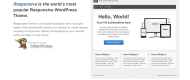
Purchase a new responsive theme and rebuilt your site from scratch. All CMS such as WordPress and Joomla offer fully responsive website themes for very reasonable prices. The customization and installation are usually fast and easy, and can be performed without having any professional skills.
-
Mobile Plugins and Extensions
Create a mobile friendly version of your site by installing a mobile plugin or extension to your existing theme. There are many add-ons that make your site mobile friendly such as WPtouch, moJOOM, Mobile Joomla and Mobile Pack. Each plugin has its own unique features and is compatible with different themes; however, the basics are similar; the plugin detects the device in use and redirects it to the appropriate mobile version. The mobile version rearranges the content, resizes the images or removes them and reduces the loading time.
-
Adjust your existing site
There are editing changes you may apply to your site based on the aforementioned tests. Simple, small sites can be rearranged in a way that will result in a fair viewing-experience on mobile, even if they do not have a responsive layout. Go through the list below to learn about a mobile display key points.
-
Responsive galleries and media players
Having rich media displays, which are not responsive, might create two major problems for your mobile audience; first, your users will not be able to view the display properly, because of its enormous size, and more crucial, download time will be extremely long. There are various multimedia platforms that offer free or premium products and services for your rich media needs. They usually include advanced features, transition effects and customization options, which your primary theme does not provide. Personally, I find Cincopa the best platform since it grants users with a complete solution including customizable skins for image, audio and video galleries and sliders, attentive support, protection of files, remote access and pretty large amount of free hosting space and bandwidth per month. You can embed new, stylish displays such as a responsive video player within a few minutes, and it will cost you nothing!
Key Points for Mobile Page Characterization
Pay attention to the small details…
There are a few things to bear in mind, when designing a webpage for mobile usage. The small screen size and the touch feature dramatically influence the user-experience and require suitable adjustments.
- Font size for mobile screens should be pretty large to allow a convenient and efficient reading-experience.
- Buttons and links should be rather large and separated from their surroundings. You do not want users to click on the wrong element.
- Check the site’s loading time! If it takes more than a few seconds, you will lose a lot of visitors.
- Prioritize the information and make it easy to navigate. Place necessary data and links up front; contact info, map links, directions, opening hours etc. should be visible at first sight.
- Make sure both the site and installed widgets are compatible with all operating systems and screen sizes.
- Landing pages should include only essential features and content. Do not overwhelm or confuse your mobile users with long text or loads of elements.
- Add rich media widgets such as videos, music clips and image sliders. The site will look a lot more attractive and, even more importantly, it will make visitors stay longer on your page.
- Minimize the user need to type text; you better think of creative ways such as drop down menus, from which users can choose the required data.


No Comments